Using the Increased Contrast Mode CSS media query
First posted 21st June 2021 in Accessibility, CSS, Design and Development; updated 22nd June 2021
A couple of years ago I revised the colours on this website in order to satisfy the enhanced contrast WCAG success criterion. It turned out to be more problematic than I had anticipated.
Even though the text on my website is always larger than 18.66px, meaning I don’t have to hit a 7 to 1 contrast ratio, the 4.5 to 1 constraint was still causing problems:
- The colours were almost all different between Light and Dark Modes
- Differentiating the default, focus and hover states of links, buttons and form controls was tough
- Links in ‘highlight’ boxes, used for calls to action and featured blog posts, which have a light blue background in Light Mode and a lighter grey background in Dark Mode, needed a different blue
- Inline code needed a darkened blue so as not to contrast too much against the darkened background
- The Dark Mode code syntax highlight colours looked washed out; creating enough contrast meant desaturating the colour, as well as lightening
- Some Light Mode code syntax highlight colours, like yellow, looked muddy and over-dark
A lack of vibrancy, a bit of a visual mess, a bloated codebase, and still there were some states that didn’t quite have a high-enough contrast ratio. Meeting AAA contrast is hard.
Enter prefers-contrast
Earlier this year, Apple added the prefers-contrast: more media query to Safari Technology Preview (Safari TP). This is a CSS User Preference Media Feature that sits alongside prefers-reduced-motion and prefers-color-scheme, allowing users’ operating-system preferences to be respected by websites.
Note: this is different to, and much more flexible than, Windows High Contrast Mode.
Turning on Increased Contrast Mode
On Mac and iOS, respectively, the Increased Contrast Mode setting can be found in:
- System Preferences → Accessibility → Display → Increase contrast
- Settings → Accessibility → Display & Text Size → Increase Contrast
Using prefers-contrast
The code to add increased contrast styling looks something like this:
@media screen and (prefers-contrast: more) {

  body {
    background-color: black;
    color: white;
  }
}
To avoid repetition in my CSS, I used my Dark Mode theme as the basis for Increased Contrast Mode, then added higher contrast overrides where necessary:
@media screen and (prefers-color-scheme: dark), screen and (prefers-contrast: more) {
  /* Dark Mode styles go here */
}

@media screen and (prefers-contrast: more) {
  /* Increased Contrast Mode styles go here */
}
I’ve written about the SCSS mixins I use, separately.
Cutting myself some slack
By giving visitors to my website who require increased contrast the ‘enhanced’ level of contrast, and all others the ‘minimum’ level in both Light and Dark Mode, I was able to:
- Make the colours vibrant again
- Reduce code complexity
- Comfortably meet the AA standard for all ‘states’
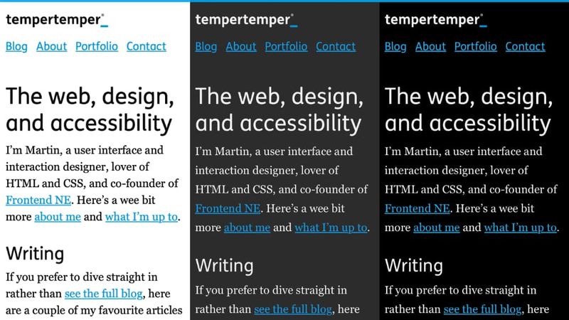
Here’s how the website looks in Light, Dark, and Increased Contrast Modes:
I’ve also made a few other changes in order to reduce complexity further:
- Removed colour from focus styling, preferring black/white outlines, depending on Light or Dark mode
- Hovering always increases the contrast of the blue text against its background, so in Light Mode the blue of links and buttons darkens; in Dark Mode and Increased Contrast Mode it lightens
- Inline code snippets no longer use blue text; they’re not interactive so the colour didn’t make sense
Can I use?
Can I Use doesn’t list it as available in either Safari TP or Safari, but it’s definitely there:
- Safari TP shipped it in version 119
- It quietly made it to Safari for both macOS and iOS last month, although it wasn’t mentioned in the 14.1 release notes
It’s part of the CSS Media Queries Level 5 spec so it won’t be long before more browsers follow Safari’s lead. In the meantime it’s a nice progressive enhancement that has allowed my website the flexibility to breathe bit more.