Cleaner focus outlines with box-decoration-break
Posted 8th April 2021 in CSS
Until the week before last, my site’s form input focus styling was a bit all over the place, so I spent some time designing a consistent style for form inputs, including buttons. I settled upon:
- a black outline in Light Mode
- a white outline in Dark Mode
The outlines (actually using box-shadow, rather than outline, so that the outline follows the rounded corners of the inputs and buttons) are:
- high contrast against their background
- high contrast against the blue button or input border they surround
- 3px thick, increasing the input’s overall size slightly
This ensures that I’m not communicating meaning solely with colour and preempts the up-coming Focus Appearance (Minimum) success criterion in WCAG 2.2.
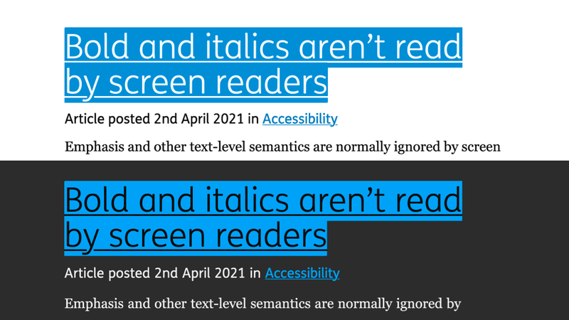
But what about links? The link focus styling was now different to forms and buttons; it changed the background colour of the link to a blue but didn’t add an outline:

This was fine from an accessibility point of view, but consistency is important; especially when highlighting things that can be interacted with: an outline for some elements, a background colour for others…
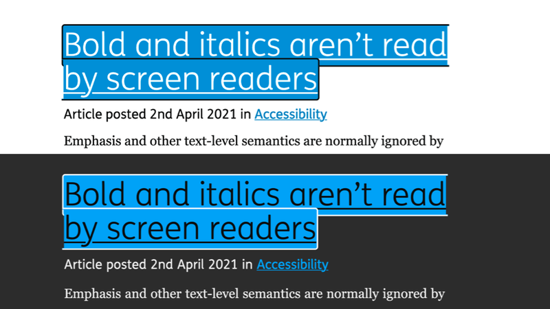
I had tried it adding a border to focused links, but it looked a bit messy when links broke onto a new line, so I resigned myself to a difference between links’ and other elements’ focus styling:

Just the other day, though, I spotted a tweet from Josh W. Comeau that mentioned box-decoration-break which, after a bit of reading up on MDN Web Docs, looked like it might solve my messy outline problem!
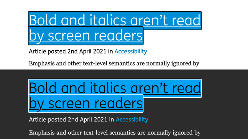
So I added the following to my focus style to see what would happen:
box-decoration-break: clone;The result was exactly what I was after:

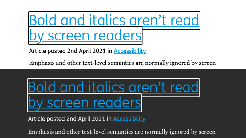
Where previously I was using a blue background and inverting the text colour, bringing links in line with forms would mean simply adding an outline, so I went one step further and went outline-only:

The good news is that box-decoration-break has great support across all modern browsers when used with the -webkit- prefix, and on browsers that don’t support box-decoration-break it still does its job; just looks a bit messier.