Like? Follow? No thanks!
They may seem like the perfect way to get more of your visitors engaged with your business but having Facebook ‘Like’ buttons and Twitter ‘Follow’ buttons may actually be turning people away!
Like, Tweet, Follow, +1, Share… allowing your website’s visitors to engage with your choice of social media is a great idea. It allows your visitors to keep up to speed with what you’re posting via whichever social network you both use.
Like most things, they have positives and negatives and it may come as a surprise that including something as seemingly straightforward as a couple of little buttons turns out to be a fairly big decision.
Advantages
So why bother with buttons? Why not just a link to your Facebook/Twitter/Google+ page and let your visitor Like/Follow from there?
First of all, the buttons allow people to Like/Follow you in the easiest possible way. A single click is all it takes. That’s a click less than a link to your social media page takes. Without the button, a link takes them to your page and they have to then look for the Follow/Like button. In the time between clicking that first link and then then engaging with your social media page anything can happen: their attention may be diverted (an advert or interesting link), taking them away from your page before they hit the Follow/Like button.
Another advantage is that your visitors stay on your website. Without a button they link out to your social media page to engage with you, and the chances are they’ll stay on Twitter/Facebook for a short while. They’ll now be following you so they’ll probably come back to your site eventually, but, for now, you might have lost them.
Peer pressure is alive and well! Like it or not, we’re pack animals, and that little number next to the social media button tells your visitors that the article they’re reading or the website they’re on is worth coming back to!
Disadvantages
Social media buttons are easily identifiable but—let’s face it—they’re not necessarily the most stylish things in the world! And, unfortunately, there’s next to nothing your web designer can do about this.
All social media buttons are different; sometimes they’re stacked, with the number on top of the button, sometimes they’re in-line, with the number to the right of the button. Most have similar options, but none are identical, so it’s difficult to create a consistent style for your site. The colour schemes may also clash with your website’s style. In short, the buttons can look ‘stuck on’.
At the time of writing, Facebook’s button hasn’t been updated to look nice on those high-resolution screens that are becoming the norm on mobile devices and some laptops. This reliance on a third party like Facebook or Twitter to style a part of your website isn’t ideal.
That raises another point – Twitter has updated its button for high-definition screens. They also updated their logo recently. So if they can change the button whenever they like, the next time they do, it may not sit nicely with your website.
Oh, and another thing, don’t they feel a little bit like tiny adverts?
The reason I’ve ditched buttons
Most of my Facebook page’s likes and Twitter profile’s follows come from the social media site itself. I wasn’t getting many via the buttons on my website. Similarly, the articles on my website had buttons for sharing that particular article; these were hardly touched, despite the article itself being fairly well read.
This in itself isn’t an issue as I was getting some engagement via the buttons… The main reason I removed them from my site was that they take ages to download!
I’m not going to get into technicalities – they’re deceptively complex little things and do a great job of doing what they do in the shortest possible time. But they’re not fast enough. One button can often take as long as a whole web page to download.
Who cares?
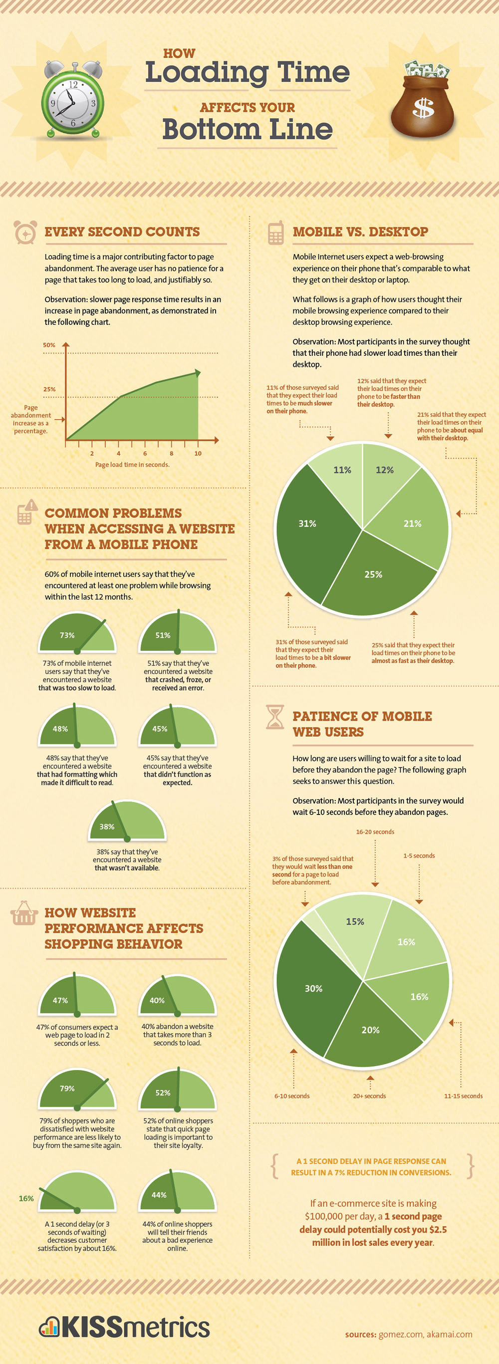
So you might be asking yourself why its important to keep download times to a minimum. Well, it’s not all that important for those of us sitting at home using our super-fast broadband, but consider those in areas where the internet connection isn’t all that swish. Or what about people visiting your website on their mobile?
Mobile internet usage is massive and growing. You don’t want to exclude these people from your website. Most visitors are fairly impatient and will abandon your page if it takes too long to appear in their browser.
Search engines
As if your users’ experience on your site wasn’t enough, search engines like Google measure the page-load time on your website and the quicker it loads, the more brownie points you’ll get and the higher up in the rankings you’ll go!
What do you think?
I’ve given the matter a lot of thought and, in the end, have decided to abandon the wee buttons on my site in favour of straightforward links that load in an instant and look nice and in-keeping with my website, but that doesn’t mean you should too!
I’d love to know your thoughts on the matter over on Twitter!