Sentence case versus title case
Posted 31st March 2021 in Accessibility and Design
I’m a fan of good typography, and something I come across a fair bit is what is the best case to use for headings; sentence case or title case.
First up, some definitions:
- Sentence case is when a heading is written like a sentence, with a capital initial on the first word, followed by lowercase initials for the rest of the heading, like this: “Hello world”
- Title case is when a heading is written with capital initials for all its words, like “Hello World”
Title case can be complicated
On the surface, title case seems straightforward, but what about those shorter, frequently used words like a, an, and, in, on, and so on. These are usually not capitalised, so there must be some rules…
Turns out it varies from person to person; brand to brand.
Apple’s Human Interface Guidelines prescribe the following for title case:
capitalize every word except:
- Articles (a, an, the)
- Coordinating conjunctions (and, or)
- Prepositions of four or fewer letters, except when the preposition is part of a verb phrase, as in “Starting Up the Computer” In title style, always capitalize the first and last word, even if it is an article, a conjunction, or a preposition of four or fewer letters
Compare that mess to the simplicity of their sentence case instructions:
the first word is capitalized and the rest of the words are lowercase, unless they are proper nouns or proper adjectives
Title case places importance on every word
Giving a reader pause at every word might be important; song titles, for example, are carefully constructed and every word counts. As a songwriter, you want your listeners to think about every one of those words.
Headings are important, of course, but do you want your reader to give pause at every word? Or do you prefer that they use the heading to quickly glean the intention of the section below it?
Sentence case is more readable, especially for longer headings.
Title case can confuse meaning
It’s easier to pick out proper nouns like place names in sentence case.
Embarrassing fact: when the film Burn After Reading was released in 2008, I thought it was referring to the town in southern England, or a town with the same name in the USA. Having watched the film some years later, I realised that it was referring to burning a note containing sensitive information after you’ve read it!
I might be on my own with that one, but imagine the following made-up heading:
How to Get to Reading
Is this talking about motivating yourself to read or the route to the town? Using sentence case, there’s no doubt that it’s about the town:
How to get to Reading
If sentence case were used for film titles, I wouldn’t have misinterpreted it: ‘Burn after reading’ is unambiguous.
Accessibility
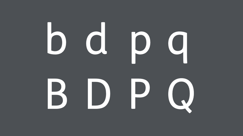
Talking of ambiguity, indistinct letter forms can be an issue for dyslexic readers. A lot of typefaces are just rotations or reflections of the same glyph, for example, lowercase b, d, p and q. A positive of using title case is that these letterforms are more distinct when capitalised: B, D, P and Q. Of course, it’s only on the initial letters of the words, but it’s something.
But this should be balanced with the extra difficulty title case presents when quickly scanning headings, and easily interpreting meaning.
What I do
The typeface I use for headings on my website was designed specifically to combat the problem of indistinct letterforms:
- the
bis very plain, with a more rounded counter than thed - the
dhas that slightly more angular counter, and a serif at the bottom-right - the
phas a spur at the top-left - the
qis a 180º rotation of theb, but descender leans very slightly to the right

So I’m happy that each letter in FS-Me is distinct enough to use sentence case, which also means my headings are easier to scan.
There’s also more consistency as the rules are simpler; with title case I’d be forever checking what my rules are, and wondering whether important words like ‘into’ (which is a preposition of four letters) should be an exception or not.
So I’m going with GOV.UK’s simple guidance:
Write all headings in sentence case